Type Cases
David Bolton, The Alembic Press, 1997
This work is still in progress
Contents
-
-
- Introduction
- Typecase Identification
- Chronological list of case lays
- Individual type lays
- Chronological list of case configurations (i.e. empty cases)
- Individual cases
- Notes about Upper Cases
- Notes about Lower Cases
- Notes about U.K. and U.S. Double and Job Cases
- Comparison of English Doubles
- Comparison of English type lays
- Comparison of Scottish Doubles
- Comparison of U.S. Jobs
- Three styles of California Job
- Notes on quantities of type in a fount
- Notes on quantities of type in a case
- List of sources of case illustrations
- Glossary
- Alphabetic Index
Introduction
The individual characters that comprise movable printing type are stored in large drawers, known as cases. These cases have separate compartments (boxes) for each letter, or combination of letters (ligatures). Originally, all the type for a particular face or size was stored in one large, square, case but it became the practice fairly early on in, for example, England, France, Belgium, to split the type between two, smaller, rectangular cases. Not only was it then easier to handle the weight of the cases, but a larger amount of any particular type face could then be stored. Thus Belgium had divided (ie pairs of) cases by 1563, England by 1588, and France at least by 1723 if not earlier. However, whilst English speaking countries and many European countries used pairs of cases, the German and Scandinavian countries continued with the single case (probably because they did not use the Roman alphabet, and thus made no use of small capitals, or accented letters). At the end of the nineteenth century, the need for two separate cases began to diminish, as mechanical typesetting become more common, and a single case, although the same size as one of the pair, again became adopted by many printers in France, U.S.A., U.K., etc.Type cases vay in size. For example, Moxon's cases were 31 inches by 18½ inches (and about 1¼ inches internal depth, but deeper for larger sizes of type). Johnson (1824) gives sizes of 42½ x 18½ x 3½ ins and 32½ x 15¼ x 2½ ins for earlier cases and 32½ x 14½ x 11/8 ins for new cases. Modern English cases are 32½ x 14½, Scottish are 34 x 15, U.S. are 323/16 x 165/8, Dutch are 325/8 x 13 or 32½ x 20, German are 26 x 24 ins, etc. Also, as well as full-size cases, there are Three Quarter, Two Third, Half, Quarter, Eighth, Tenth sized cases, and larger cases (eg 32 x 23 and 44 x 23) for wood and poster type, or Indian types (36 x 16), etc. A fuller range of sizes is given in the Glossary. Although cases vary in overall dimension between country of origin, they often vary slightly between manufacturer, so that one manufacturer's cases will not quite fit in a frame supplied by a different manufacturer. Presumably this was a means of keeping customers captive.Type cases also vary in box configuration, depending upon the intended use (eg capitals, lower case, accents), and on the type of alphabet (eg Roman, Greek, Arabic, Hindi, etc). The allocation of a character to a particular box can vary, depending on the language being type set, where certain characters have a different frequency of use as between, say, French, English, Italian, Spanish. Many of these case variations can be seen in the pages linked below.
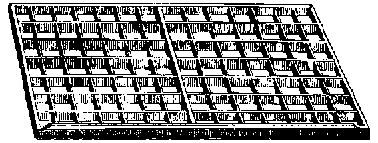 |
An ordinary Upper Case as illustrated by Southward (1887) and consisting of 98 equal sized boxes to hold capital and small capital letters. This style was shown by Moxon in 1683, and continues in use to the present day, but there are variants in the construction and these, and the many layouts of the letters, can be found from the links below.
|
Note that an Upper case is normally paired with its companion Lower case, and the two cases shelved one above the other in and on the frame (or rack).
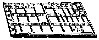 |
An ordinary Lower Case as illustrated by Southward (1887) and consisting of 53 variously sized boxes to hold the small letters, punctuation and spaces.
There are many variations in both the construction and layout of characters in this case, which can be found from the links below. |
Arising from an attempt to answer various queries on the LETPRESS listserve group, a variety of type layouts and styles of typecase are shown here. Blank case layouts are also shown, to allow insertion of one's own lay. The pages are all separate, for ease of printing out, or downloading. Some diagrams suffer slightly from distortion by the html code used to display the cases, and none are to a specific scale. It can sometimes improve a printout by changing from high to medium print quality for some layouts. Some 220 cases are shown to date, concentrating mostly on normal (ie full) size cases for metal type, although several two-third sized cases and a few half and quarter sized cases are included. A few cases for wood letter, music, spaces and quads, etc are shown for interest, and because the empty cases could be used for storing normal type. Cases for leads, rules, and some more exotic cases, are excluded because of the difficulty of interpreting their construction with basic html code. The same arises with non-latin type faces, but a few such type lays are included as scanned images. Dates are given, as derived from the source document, but in many cases there may be an earlier edition, or reference, that has not yet been consulted. Also, a layout dated eg 1970, has probably been in use for a considerable time before that date.These pages were first created in 1997, and are still being developed, as more information comes to light, and as time permits. As yet not all the information displayed has been fully correlated, and case dates in particular can change as earlier occurances are found. Please e-mail alembicpress@googlemail.com if anything appears wrong, or missing.
Choose from the following groupings:
Blank cases
Upper ....
Lower ....
Double ....
Job ....
Single ....
Triple ....
Quadruple
Two-Third ....
Half ....
One-Third ....
Quarter ....
Music ....
Figure ....
Spacing
Others (eg Junior, Three-Quarter, Fount, Border, Accent, etc.)
Arabic ....
Australian ....
Belgian ....
Chinese ....
Czech ....
Danish ....
Dutch
Egyptian ....
English ....
French ....
Georgian ....
German ....
Greek ....
Hebrew ....
Hungarian
Indian ....
Italian ....
Malayan ....
Maori ....
Mongolian ....
Polish ....
Portuguese ....
Russian
Scottish ....
Spanish ....
Swedish ....
Swiss ....
Syriac ....
U.S. ....
Vietnamese
All, in chronological order, earliest first
All, in chronological order, most recent first
Layouts
Upper ....
Lower ....
Double ....
Job ....
Single ....
Two-Third ....
Figure
Others (eg Triple, Quadruple, Fount, Music, Half, etc.)
Australian ....
Belgian ....
Czech ....
Danish ....
Dutch ....
Egyptian ....
English
French ....
Georgian ....
German ....
Greek ....
Hebrew ....
Indian ....
Irish ....
Italian
Maori ....
Mongolian ....
New Zealand ....
Polish ....
Portuguese ....
Russian ....
Scottish ....
Spanish
Swedish ....
Swiss ....
U.S. ....
Vietnamese
All, in chronological order, earliest first
All, in chronological order, most recent first
General
Glossary of terms .... List of Sources ... Index of Typecases
Quantities of type in a fount .... Quantities of type in a case
Notes on Upper Case styles .... Notes on Lower Case styles
Notes on Job and Double Case styles and contents
Typecase Identification
Go to Alembic Home Page
The Alembic Press
A Fine Press creating and printing limited edition books by traditional letterpress.
This page was written by David Bolton and last updated 25 June 2026.
References:
| Belgium (ie Plantin) | in: | Gaskell, New Introduction to Bibliography 1972 p.34 |
| probably (ie proposed) | in: | De Vinne, Modern Methods of Book Composition 1923 p.14 |
| Moxon | in: | Moxon, Mechanick Exercises on the Whole Art of Printing 1683 p.28 |
| Johnson | in: | Johnson, Typographia 1824 p.50 |
| Southward | in: | Southward, Practical Printing, 3rd ed 1887 p.47 |